Identity systems that hold up everywhere
A logo is the smallest part of it. We build the whole system — colour, type, layout and voice — so your brand stays recognisable on a billboard, a business card and a 40px avatar.
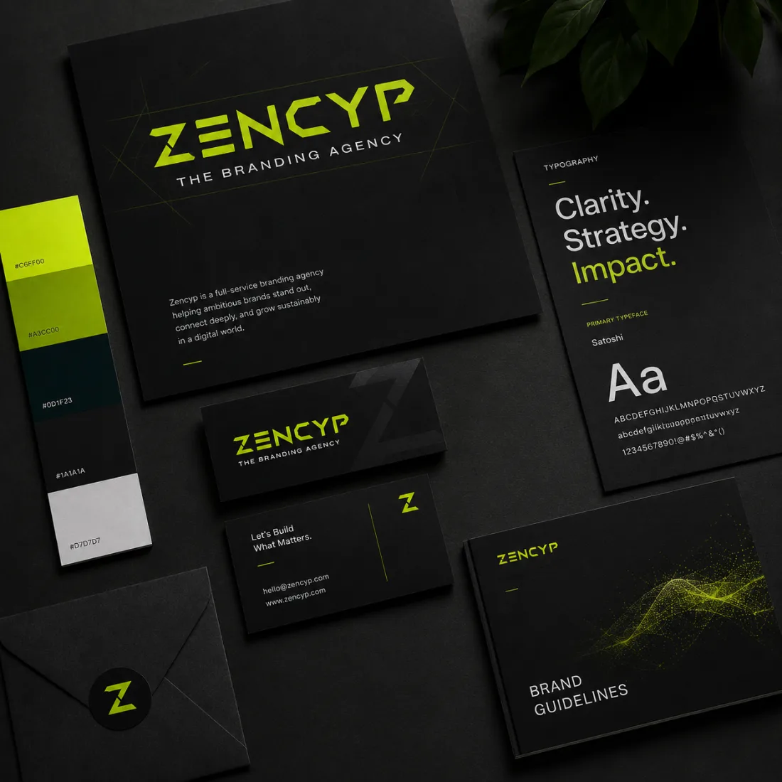
A logo is not a brand. A system is.
Most brands do not break at the mark. They break at the fourth application, when nobody can say what is correct any more. One system, defined once, keeps every surface agreeing.
A logo only
and no rules around it
Colour drifts
with every designer
Pack and web
look like two brands
Every new asset
starts an argument
Packaging
holds at shelf distance
Website
converts on trust
Social
recognisable mid-feed
Print & signage
reproduces in one colour
One brand system, defined once
Every palette ships with tested contrast pairings, so the brand stays legible before it stays pretty.
One workhorse sans for everything functional, one serif italic reserved for emphasis. Two families, strictly enforced.
Everything, handed over properly
Need an identity that scales?
Tell us where the brand is going and we'll build the system to get it there.
Book a call